Vaadin Brand Toolkit
A brand is more than just a logo. Just like a SaaS web app, a brand is designed to deliver a consistent experience to its audience, and stand out from the competition. It has a backend that models the business domain. The frontend is built from unique components, each contributing to the overall experience.
Version 3.0
Updated Jun 02, 2025
01
Developer Personality
While all the other brand guidelines might bend and break from time to time, this must always hold true: Vaadin always acts as a professional developer, and communicates like a developer to another developer.
Vaadin always communicates like a developer to another developer through its brand persona.
Helpful expert
A helpful expert shares real knowledge, offers practical solutions, and guides others through challenges without making them feel small.
Straight to the point
Good developers usually prefer getting straight to point instead of beating around the bush.
Informal pro
Informality is a universally recognized part of developer culture.
Genuine
Relaxed, down-to-earth behavior where you can be yourself without maintaining an additional facade.
Smart geekiness
Geekiness isn't just tolerated in developer culture; it's a badge of authenticity.
Nordic cool
Being associated with the Nordic way of living has always been cool.
The Geekiness Exception: your permission to play in cool and exciting new ways
If you come up with a novel idea to express the Vaadin brand in a cool, geeky way that other developers will find awesome and marvellous - do it!
Don't sweat the details, it's the thought that counts.
02
Vaadin Logo
The Vaadin logo is a combination of the recognizable, minimalistic vertical reindeer head logomark, and the textual logotype. The logomark symbol can be used alone on many occassions, but the logotype must always be together with the symbol.
Lock-up
The Vaadin brand mark consists of two elements: the wordmark and the symbol, together forming the lockup. The full lockup should be used in most cases, especially when representing the company or the product.
In more informal or community-driven contexts, the logo symbol may be used on its own. This is typically reserved for more for personal use—like internal materials, swag, or community-facing content—where the symbol represents the people behind the brand.
Whenever the symbol is used independently:
- Make sure the audience recognises it as part of the Vaadin brand.
- Always use the symbol in its correct orientation: horns up, never rotated.
In all other cases, prioritise the full lockup to ensure clarity and brand recognition.
Logo

Exclusion zones


Logo color
Use the logo in White, Black, Blue, or Violet. These are the approved options - stick to them for clarity and consistency.
When placing the logo on a white background, use the black wordmark with the blue symbol. On a black background, use the white wordmark with the blue symbol. If the background is blue or violet, use the logo entirely in white, both the wordmark and the symbol.
Do not use the logo in any of the secondary colours.
In a context where colors are not available, use a fully black or fully white version of the logo, depending on which one produces a better contrast against the background. In other words, do not use a grayscale version of the logo with the blue symbol.
White background: Use black wordmark with blue symbol.
Black background: Use white wordmark with blue symbol.
Blue background: Use white wordmark with white symbol.
Violet background: Use white wordmark with white symbol.
Logo Misuse
DON'T alter the logo's colors in any way
DON'T change the relationship of the logo's components
DON'T rotate the logo
DON'T alter the symbol's colors in any way
DON'T place the symbol inside another shape
DON'T rotate the symbol to point to the right
03
Colors
Color is one of the most recognisable elements of our visual identity. It sets the tone and connects the brand experience across product and marketing. Our palette is designed to feel modern and expressive, while staying functional and accessible—and building a sense of familiarity throughout the journey.
Main Colors
Our colour palette connects the product and marketing experience, building familiarity and visual consistency. The two blues are closely tied to the colours users see in the product, helping make the transition between brand and product feel seamless.
Black is used more prominently in marketing and specific parts of the website to create contrast and draw attention—especially early in the user journey. As users move further into the experience, the atmosphere shifts towards lighter, more neutral tones, where colour takes on a more supportive role.
Blue
#056ff0
5,111,240,100
Violet
#4b2eff
75,46,255,100
Warm Blue
#00ade7
0,173,231,100
Off Blue
#f0f4f7
240,244,247,100
Black
#0f0f0f
15,15,15,100
White
#ffffff
255,255,255,100
Gradients
Gradients are a key part of our brand identity. They bring energy and depth and can be used on typography, over black and/or white, or as a background element.
Their use is most effective in marketing and in selected areas of the website where we want to guide attention and create visual impact. This is particularly relevant in the early stages, where the experience is designed to feel bold and expressive.
Gradient over white background
Linear
#056ff0 → #25d8d8
Gradient over black background
Linear
#056ff0 → #03f7ff
Terminal on White
For light backgrounds, the terminal code snippets use colours that create a clear distinction between elements while maintaining a natural flow with the overall brand design.
Royal Blue
#0051FF
0,81,255,100
Navy
#32407A
50,64,122,100
Marine
#029FC6
2,159,198,100
Azure
#3BADFF
59,173,255,100
Magenta
#D40CD4
212,12,212,100
Iris
#B909FF
185,9,255,100
Pine
#04869A
4,134,154,100
Verde
#0BB59A
11,181,154,100
Onyx
#151515
21,21,21,100
Ash
#454545
69,69,69,100
Stone
#5C5C5C
92,92,92,100
Silver
#8C8C8C
140,140,140,100
Terminal on Black
On dark backgrounds, the terminal code snippets are designed to stand out with stronger contrast, ensuring readability against the darker tones.
Teal
#059F8C
5,159,140,100
Mint
#05C5AE
5,197,174,100
Aqua
#0ADCC3
10,220,195,100
Neon
#03FFE0
3,255,224,100
Lavender
#D39AF7
211,154,247,100
Cyan
#2E9BDB
46,155,219,100
Frost
#7AA2F7
122,162,247,100
Ice
#7DCFFF
125,207,255,100
Charcoal
#414247
65,66,71,100
Granite
#7A7E85
122,126,133,100
Steel
#ABADB3
171,173,179,100
Chalk
#BCBEC4
188,190,196,100
Gray
Gray 900
#272727
39,39,39,100
Gray 800
#3f3f3f
63,63,63,100
Gray 700
#575757
87,87,87,100
Gray 600
#6f6f6f
111,111,111,100
Gray 500
#878787
135,135,135,100
Gray 400
#9f9f9f
159,159,159,100
Gray 300
#9f9f9f
159,159,159,100
Gray 150
#dbdbdb
219,219,219,100
Blue
Blue 900
#0A3669
10,54,105,100
Blue 800
#0B3F80
11,63,128,100
Blue 700
#0A4996
10,73,150,100
Blue 600
#0752AD
7,82,173,100
Blue 500
#0657B8
6,87,184,100
Blue 400
#085CC3
8,92,195,100
Blue 300
#0961CE
9,97,206,100
Blue 150
#0565DB
5,101,219,100
Violet
Violet 900
#271C6F
39,28,111,100
Violet 800
#2D1F87
45,31,135,100
Violet 700
#32229F
50,34,159,100
Violet 600
#3925B7
57,37,183,100
Violet 500
#3C26C3
60,38,195,100
Violet 400
#3F28CF
63,40,207,100
Violet 300
#4229DB
66,41,219,100
Violet 150
#452BE7
69,37,183,100
04
Typography
Typography plays a key role in shaping the voice and clarity of our brand. It supports how we communicate—clearly, confidently, and with a touch of warmth. Our type choices and scale create consistency across touchpoints, helping content feel structured, readable, and distinctly Vaadin, whether on screen or in print.
NB International Pro
AaBbCc
012345¾
{%@#<>}
Sgtu;
Weights & styles
Bold
Medium
Regular
Mono
Usage chart
The type scale defines the relationship between font sizes and line heights across our design system. It helps maintain consistency and readability, adapting to the size and purpose of the text. Body text uses more generous line spacing for comfortable reading, while headings and larger type tighten the spacing to create stronger visual structure and impact.
| Size | Weights | Line-height | Tracking |
|---|---|---|---|
| 12 px | Mono | 120% | -4% |
| 12 px | Regular | 120% | +2% |
| 14 px | Mono | 100% | -7% |
| 14 px | Regular | 100% | 0% |
| 16 px | Medium | 100% | +1% |
| 17 px | Regular | 120% | +1% |
| 19 px | Mono | 140% | -7% |
| 19 px | Regular | 140% | +1% |
| 19 px | Medium | 140% | +1% |
| 22 px | Regular | 140% | +1% |
| 22 px | Bold | 140% | 0% |
| 32 px | Regular | 120% | 0% |
| 32 px | Bold | 140% | 0% |
| 40 px | Bold | 100% | -2% |
| 56 px | Bold | 100% | -3% |
| 74 px | Bold | 100% | -1% |
| 100 px | Regular | 100% | -1% |
Type hierarchy
Type hierarchy helps organise content and guide the reader’s attention. Use bold for headlines to create clear entry points, regular weight for body copy to support readability, and the mono style for call-to-actions or technical elements that need to stand out with precision.
The mono font should also be used for source code, ASCII graphics, eyebrows, and UI elements such as buttons.
Full-stack platform makes it easy for your full-stack team to ship complete features at scale.
Based on the open W3C Web Components standard, ensuring that they work natively in all modern browsers and can be used with virtually any front-end framework.
Need help?
Let's build the support package you need, together.

Webinar
The Snow Reindeer release: What's new in Vaadin 24.6
Type color use cases
The Web App Platform for Java Developers
Based on the open W3C Web Components standard, ensuring that they work natively in all modern browsers.
Headline in white, body copy in black at 75% opacity.
The Web App Platform for Java Developers
Based on the open W3C Web Components standard, ensuring that they work natively in all modern browsers.
Headline in black, body copy in black at 75% opacity.
The Web App Platform for Java Developers
Based on the open W3C Web Components standard, ensuring that they work natively in all modern browsers.
Headline in white, body copy in white at 75% opacity.
The Web App Platform for Java Developers
Based on the open W3C Web Components standard, ensuring that they work natively in all modern browsers.
Headline in white, body copy in white at 75% opacity.
Highlights
The Web App Platform for Java Developers
Gradient highlight on text, with white as the base.
The Web App Platform for Java Developers
Gradient highlight on text, with black as the base.
Replacement fonts


System fonts

05
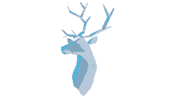
The Reindeer
The reindeer is a central visual motif in our brand, symbolising the company’s heritage. As one of the most recognisable elements of our visual identity, it appears across marketing materials, merchandise, and apparel. This unique and memorable symbol reflects the brand’s spirit and values.
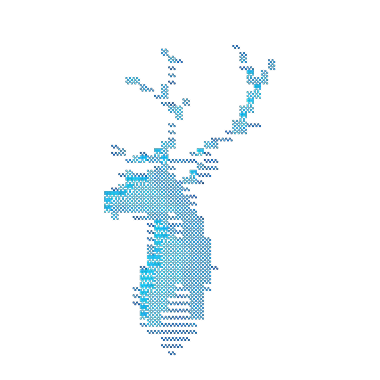
The metaphysical reindeer and its many fors of existence
The reindeer is an abstract, but a dear concept to us. We'd love to see your interpretation of the reindeer. Feel free to contribute to the cult of the reindeer with new graphic designs, generative AI art, songs or 3d prints. Here are some past work to give you an idea.
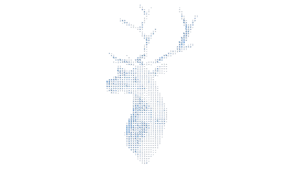
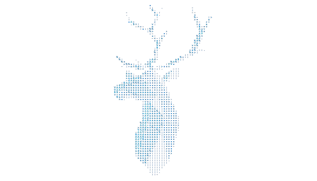
Reindeer Alignment
The reindeer is centred by its bounding box, making it appear visually off-balance.
The reindeer is aligned by its centre of gravity, creating a visually balanced composition.
Using the Reindeer in Layouts
06
Visual Assets
Our visual assets are key to communicating the essence of Vaadin's personality and serve as supporting elements for the core brand identity. These assets include everything from photos of our team and workspace to the way we represent code snippets and product screenshots. Consistency in these visuals reinforces our brand presence and contributes to a cohesive narrative.
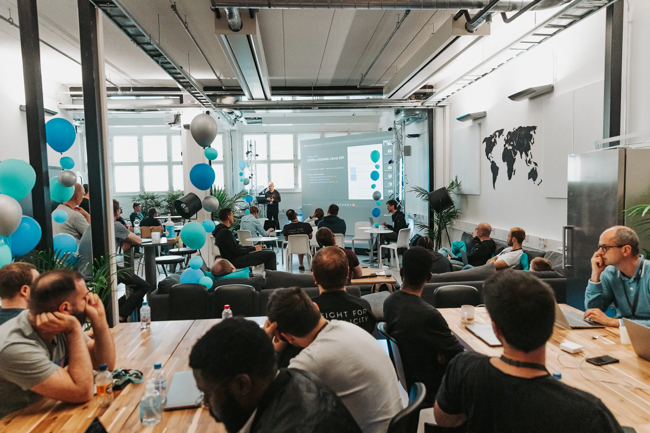
People photos


Code snippets
Code examples are a key element of our visual communication. To ensure consistency, always use either dark or light mode. If applicable, include an avatar image of the person explaining the code alongside the code terminal when featuring it on the website or in marketing materials. This adds a personal touch and reinforces the connection between the content and the people behind it.
Vaadin color schemes for IntelliJ IDEA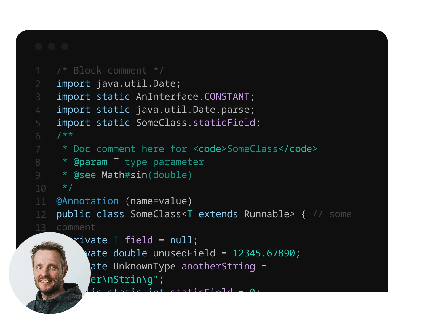

Workspace photos


Product screenshots
To maintain a clean and professional presentation, product screenshots should be centred on an off-blue background with a subtle drop shadow. Avoid visual tricks or embellishments—let the product speak for itself. Consistency in this approach is essential for a cohesive presentation of the product across both the website and presentations.
Presentation Deck
Our presentation deck is a key tool for expressing our brand and visual identity externally. The Google Deck includes a variety of templates—from highly visual to more functional—to support different presentation needs. Use it as your go-to reference for creating both internal and external decks.
Access the presentation deck here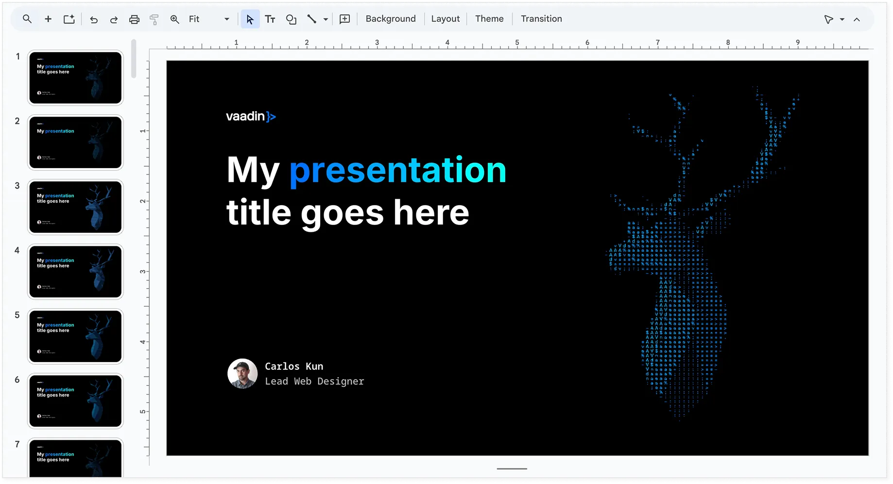
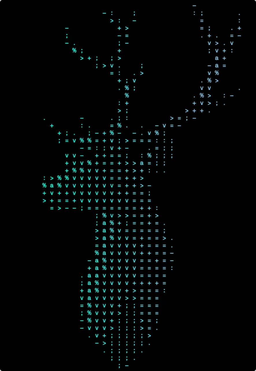
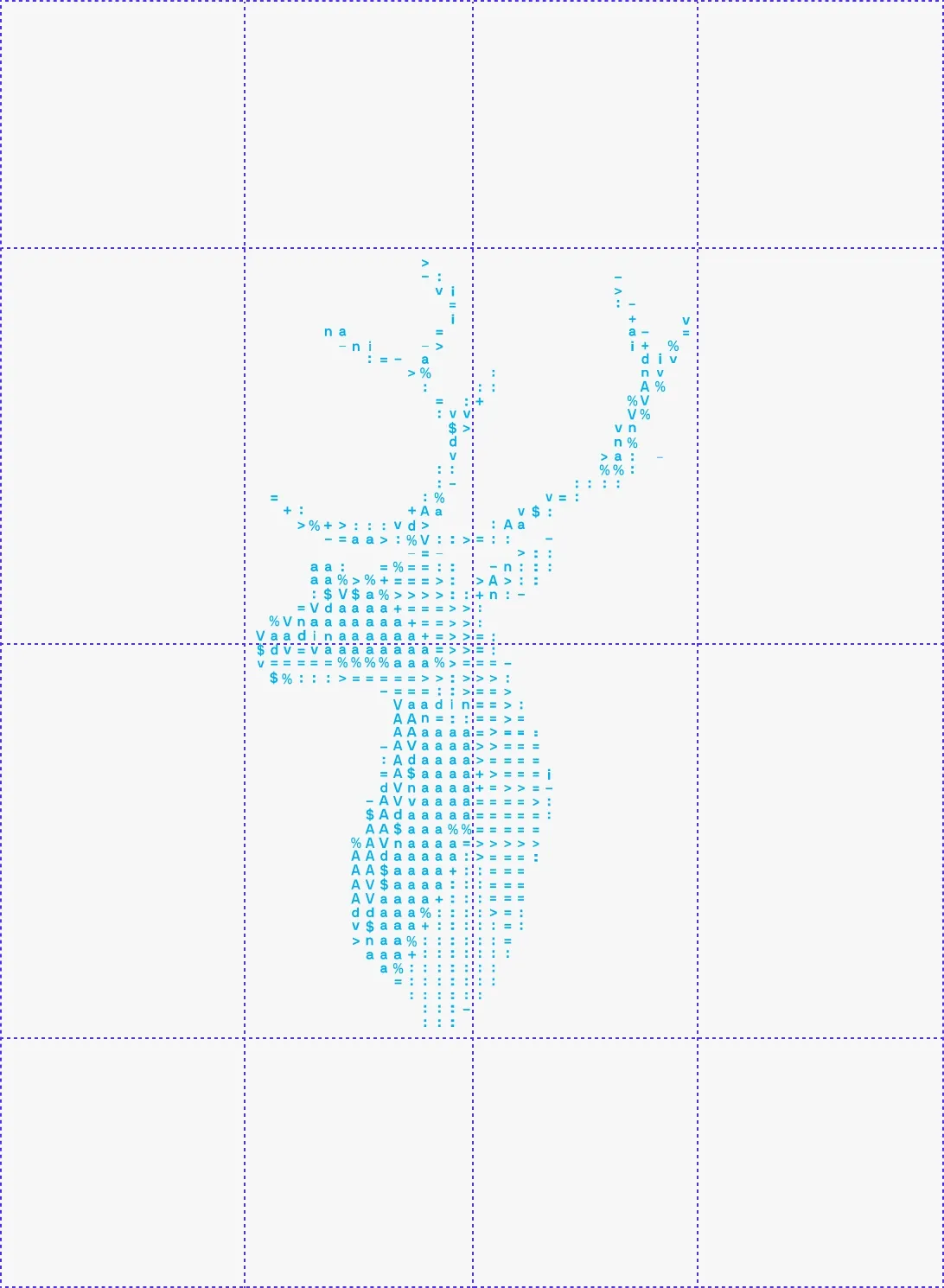
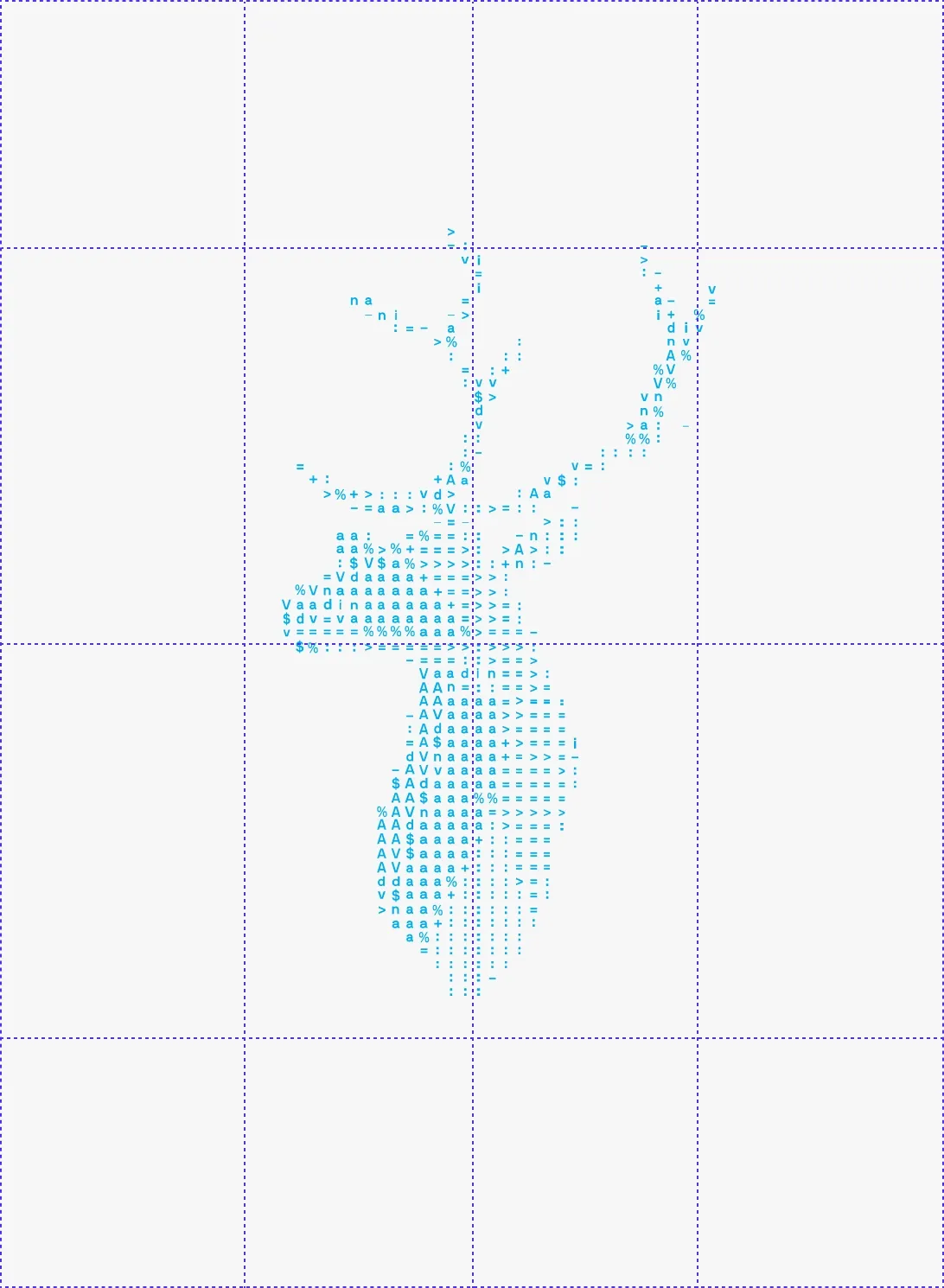
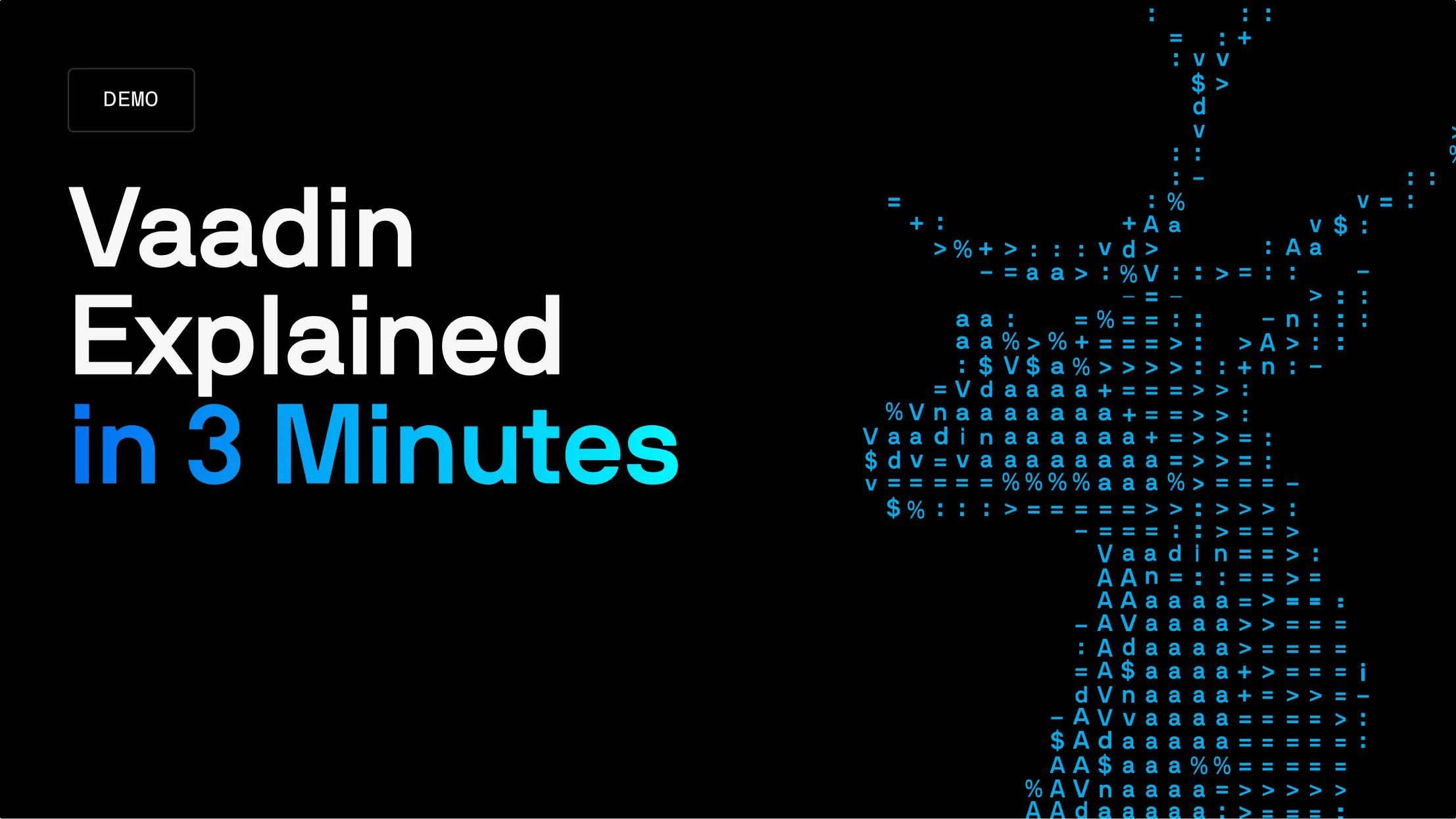
ASCII Graphics
The ASCII graphics component of our brand identity borrows from the timeless aesthetics of computer art, resonating well with our developer audience - particularly those with a Java background. These graphics will be used sparingly throughout the brand, enhancing the design without overpowering it.
Vascii is our internal tool for the purpose of creating ASCII art. It can create cool results from images and video sources. Spend an evening tweaking and experimenting with it, and it will reward you with something amazing.
Vascii editor in GitHub